Changelogs
Stay up to date with the latest changes and enhancements.
Stay up to date with the latest changes and enhancements.
Stay up to date with the latest changes and enhancements.
09. Jun 2026
Share
A focused reliability release for the ARI cash flow calculator, plus a fix for the "blank screen after an update" issue.
ARI saved & shared scenarios now calculate correctly — loan interest no longer shows as $0, and rent, property value and equity grow year to year. The values you entered no longer reset when you reopen a link. If you quoted numbers off a saved or shared scenario recently, it's worth reopening it to double-check.
Equity loans are now factored in to your interest and equity figures — and the setting stays on when you share or reopen a scenario.
Year-by-year customisations now save and share — per-year tweaks to expenses, income or growth no longer reset to defaults.
Model SMSF scenarios up to 90% LVR (raised from 80%) for higher-leverage planning. As with all SMSF loans, no LMI is applied.
The app now updates itself to the latest version automatically — no more blank screen after a release.
Fixed how saved values are read back (the root cause of the $0-interest bug), separated two clashing share-link settings, added a service-worker safeguard so deploys self-heal, and added regression tests.
09. Jun 2026
Share
More accurate land tax for properties held in a trust or company, across all states.
ARI saved & shared scenarios keep your values — purchase price and rent no longer revert when you reopen a link.
ARI fixes — corrected acquisition cost when borrowing above 100% LVR, a purchase-type parameter clash, and stale cached data.
Chat search now finds your joined workspaces, so conversations don't get missed.
Smoother message templates in the channel composer.
More reliable data loading — the freshest data always wins, with better dialog accessibility and more resilient template insertion.
Notifications hardened with tighter access rules (RLS) and new database indexes for speed.
09. Jun 2026
Share
One of the busiest releases — a full email refresh, ARI as a standalone tool, and broader access.
Emails refreshed — redesigned transactional emails, a fixed daily digest, channel grouping and working deep links. Email now sends through Resend (with a fallback), and transactional emails are BCC'd into the Attio CRM with the sender shown as "InvestorKit App".
ARI as a standalone tool — usable on any address with built-in property search, clearer gross ROIC (shown pre-CGT), an editable gross yield, and a clearer target-purchase-price explanation.
ARI presentation — equalised sale-scenario cards, mobile actions moved into the header, and redesigned segmented tabs.
ARI — mobile top bar, LVR slider fix, guided mode removed; sidebar total loan, land-value band and depreciation note; pre/post-budget growth toggle; land-tax automation and an LMI/loan breakdown fix.
New Vision tool, Due Diligence authoring, and a refreshed UI component set shipped together.
Broader access — Attio made publicly available, and shared API keys now work for non-admin users.
Maps work on more devices thanks to a Mapbox fallback, plus a general mobile sweep.
Restored the channel right-panel header, enabled the remaining masterclass chapters, and fixed a batch of reported issues.
Secret settings now resolve via a service-role client so shared keys work reliably.
09. Jun 2026
Share
A big ARI (cash flow) update focused on the 2026-27 Budget and making scenarios easier to follow.
ARI Budget 2026-27 suite — CGT and negative-gearing changes built in, with clear storytelling so you can explain the impact.
Scenarios now connect end-to-end — Scenario, savings, equity and next purchase flow through together.
Quicker inputs — a compact salary-growth shortcut, and savings now default to 10% of household pay.
Clarity and typography polish across the tool.
Foundational work for the new UI component library and the React platform move.
09. Jun 2026
Share
A big portfolio release, plus a batch of reported-issue fixes.
Portfolio Experience 2.0 — Advisor Tools, Health Insights, Property Matching, and Email Ingestion.
Workspace names and a range of portfolio UX improvements.
Market Categorisation chart updated.
Task status dropdown no longer shows duplicate entries.
16 reported issues fixed, along with general quality improvements.
Tighter data-access security (RLS) with faster direct queries, improved Attio/InvestorKit data accuracy, and build/type-safety work.
09. Jun 2026
Share
A quick mobile-focused update.
A more polished mobile experience with the new iOS 26 "Liquid Glass" styling across the app.
Upgraded the build system (Vite 8 / Rolldown) for faster, more reliable builds.
09. Jun 2026
Share
The first wave of updates after the v2.0 launch — mostly polishing communication, notifications and the portfolio.
Floating chat windows so you can keep a conversation open while you work elsewhere, plus general UI polish.
Email notifications overhauled — cleaner delivery, the ability to leave a channel, suspended/archived users no longer emailed, and inbound-email and email-piping fixes.
In-app help & feedback (Gleap) is now built into the Portal.
AI assistant can now handle email and calendar natively via a new integration.
Referrals improved, including clearer reward tiers.
iPhone: push notifications deep-link straight to the right place, with due-diligence and referrals improvements.
Scheduled-job safety (pg_cron), notification reliability, and type-safety cleanup.
09. Mar 2026
Share
Release Date: 15 March 2026
Versions Included: v2.0.0 to v2.0.6
This is easily the biggest Portal release we have shipped.
Across desktop and mobile, the InvestorKit Portal has had a massive glow-up. It is faster, cleaner, easier to move around, and a lot more useful across properties, due diligence, cash flow, ARI, chats, tasks, learning, and mobile.
The simple way to think about this release is this: the Portal is turning into an all-in-one property investing super app. Not just somewhere to message clients or check a task list, but one place to learn, analyse, collaborate, and move work forward.
There is a lot in this release, so this note is here to make it easy to understand what has changed, what is already live, what feels noticeably better, and what is still being polished over the next few days.
When staff log in, the first thing they will notice is that the Portal feels different.
The app is noticeably faster across day-to-day use
The sidebar makes a lot more sense
Tasks are much harder to miss
Properties feel like a proper analysis tool now
Mobile finally feels useful, not secondary
The big win is not just polish. It is that the Portal now asks less of the user. Less tab switching, less double handling, less manual admin, and less hunting around to find the thing you need.
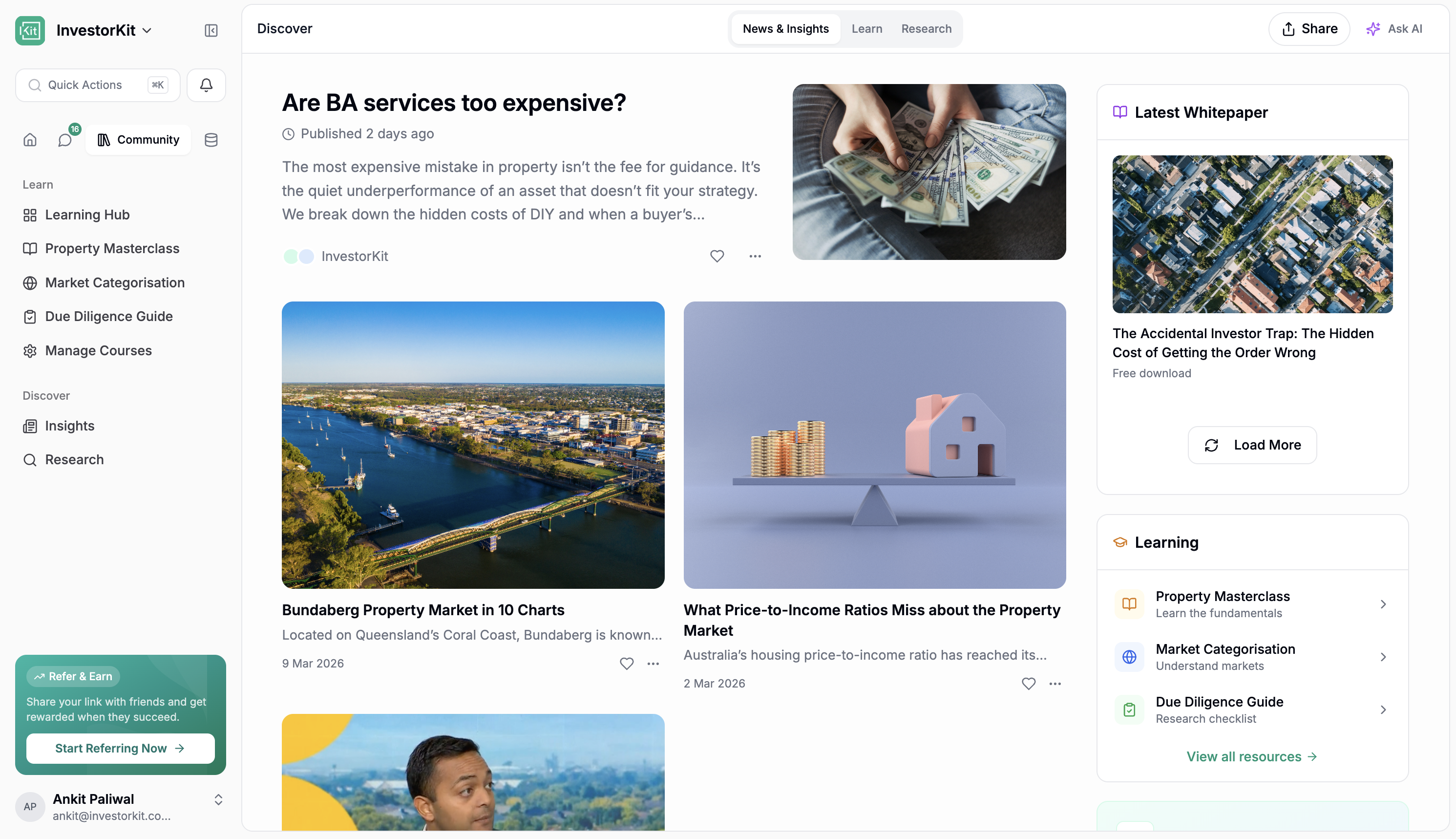
There is now a dedicated Discover section in the sidebar.
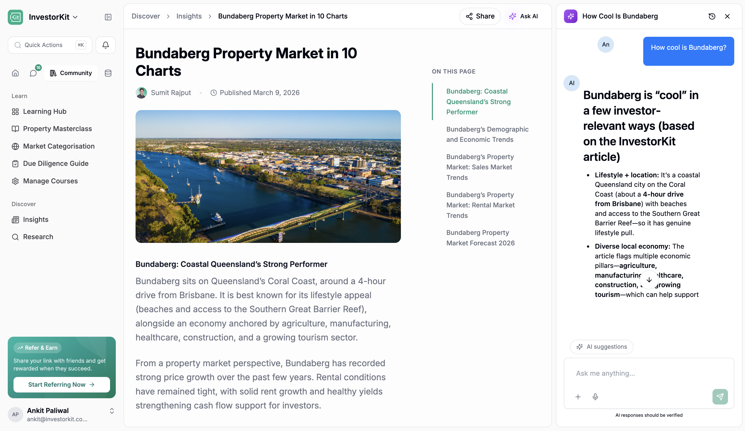
This is the new learning and content hub inside the Portal. It brings InvestorKit articles and blog content directly into the app, so staff and users can explore content without leaving the Portal. On top of that, users can ask questions about articles and get answers in context.
This makes Discover more than a content library. It becomes a way to learn from our material, revisit ideas quickly, and use AI to pull out the key points without having to read everything end to end. The AI is also tuned to stay on-brand and answer sensibly within the InvestorKit context, so it is not just a generic chatbot sitting on top of articles.
The big idea here is that Discover becomes the place where our content lives inside the product, not just on the website. Articles are there, white papers are part of the direction, and podcast listening inside the app is coming too.
Under Discover, there is now a dedicated Learn experience for LMS content and training materials.
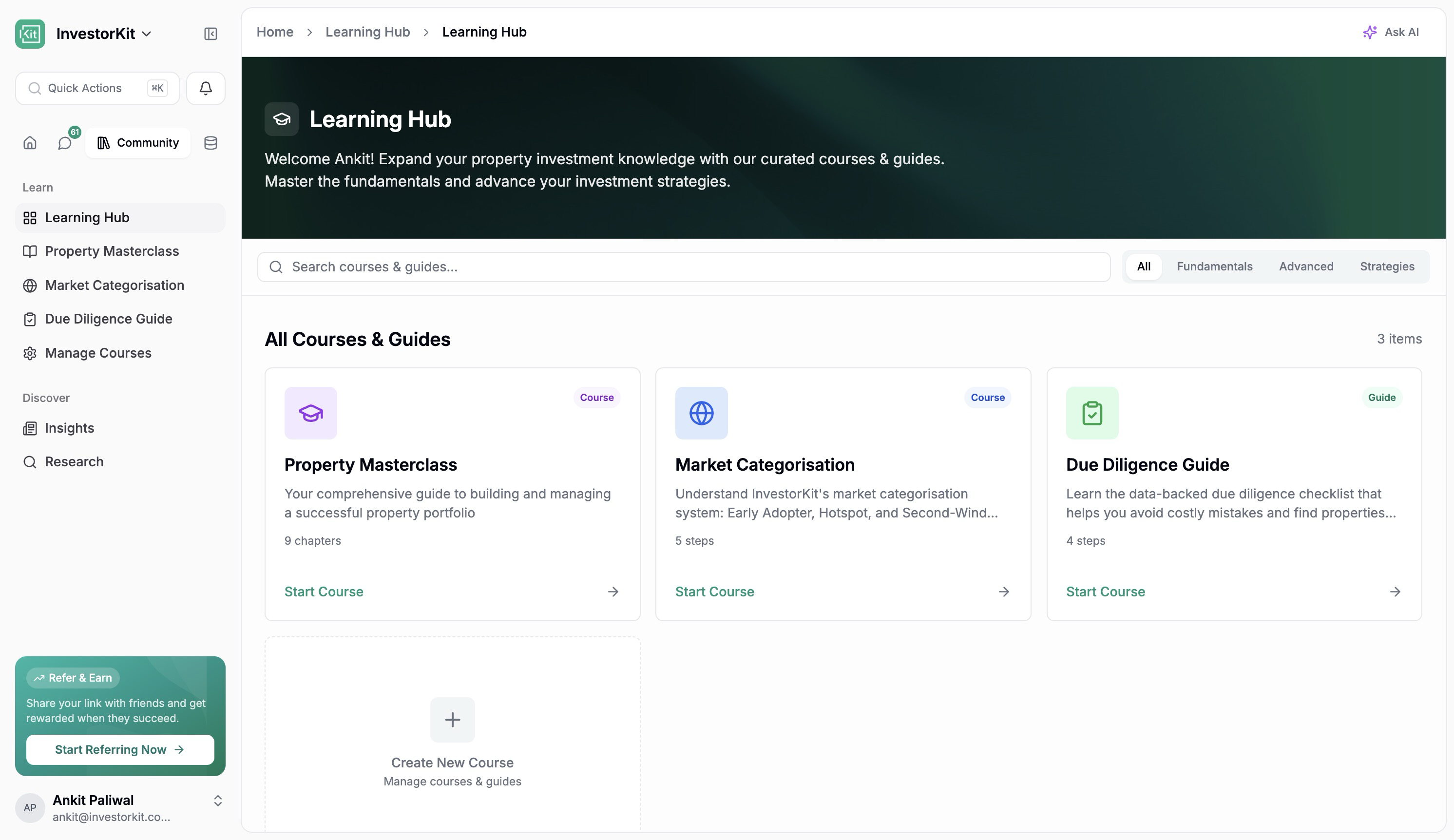
This includes existing course content such as:
Market Categorisation Course
Due Diligence Course
Masterclass
Buying Markets content, with more to be added
These courses are also important because they help teach clients how to work through the InvestorKit way of thinking, especially around things like the Market Categorisation Cycle.
What makes this especially important is that Learn is not only a place to consume training. It is also a place to create it.
Course creation now supports:
Course titles, chapters, and topics
Rich text, embeds, and video content
AI-assisted content generation
Image uploads to help AI create content
Voice support
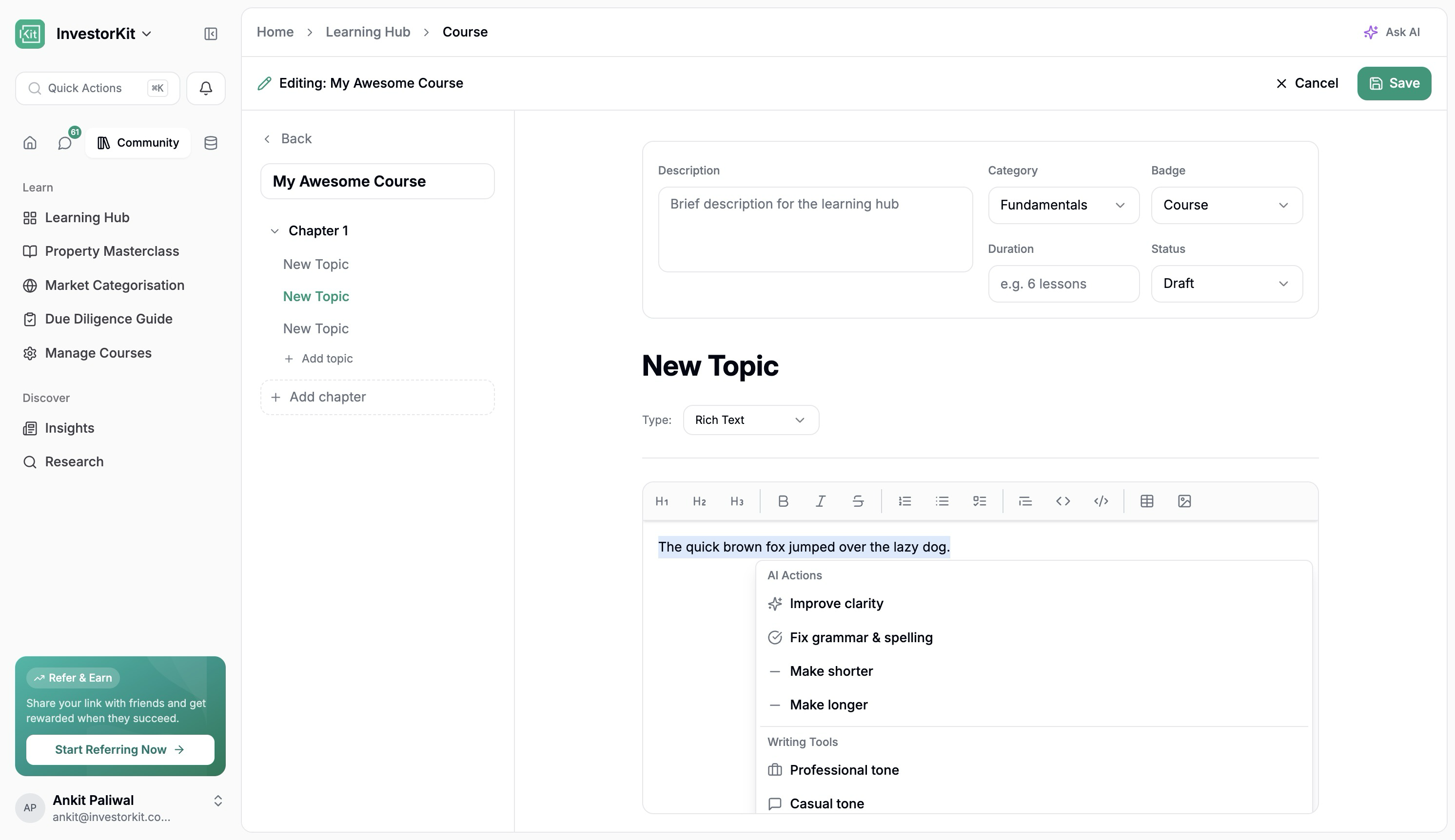
And it is not just a little AI helper either. The course builder is heading toward being able to help create large chunks of the course itself, which is huge for getting more training material into the Portal faster.
In practical terms, this means the team can build and expand InvestorKit training directly inside the Portal rather than relying on disconnected systems.
There is also more research content starting to sit alongside these learning surfaces, which makes the whole experience feel a lot more connected. Instead of content, research, and training living in separate worlds, they are starting to sit together inside the same product.
There is also a new Community section in place.
At launch, this is intentionally light and will focus mainly on Learn content and articles. The bigger point is that the Portal now has a home for community-driven experiences in future if and when the business decides to take that further.
The assistant is much more useful in this release.
It is no longer just a chat box. It is starting to behave more like a real assistant that understands InvestorKit content, Portal activity, and what people actually need help with day to day.
You can now use it to:
Ask questions about InvestorKit articles and content
Ask what tasks are due in the next 7 days
Ask what messages need catching up on
Work faster inside areas like Due Diligence
Help turn messages and context into next actions
AI is also appearing in more practical places throughout the Portal:
In article and content experiences
In course creation
In Due Diligence workflows
In messages, where dates and actions can be turned into tasks or calendar items
The assistant also feels much closer to having ChatGPT connected into our own world. It can pull on content and context from across what we already publish and use, which makes it far more practical than a blank AI chat.
The goal here is not novelty. It is usefulness. The assistant should save time, reduce manual work, and make it easier to move from information to action.
That same idea now shows up across the app in smaller but very useful ways too. AI can help with article Q&A, course creation, due diligence, suggested next steps, and turning message context into tasks or calendar items. It starts to feel much more baked into the Portal rather than bolted on.
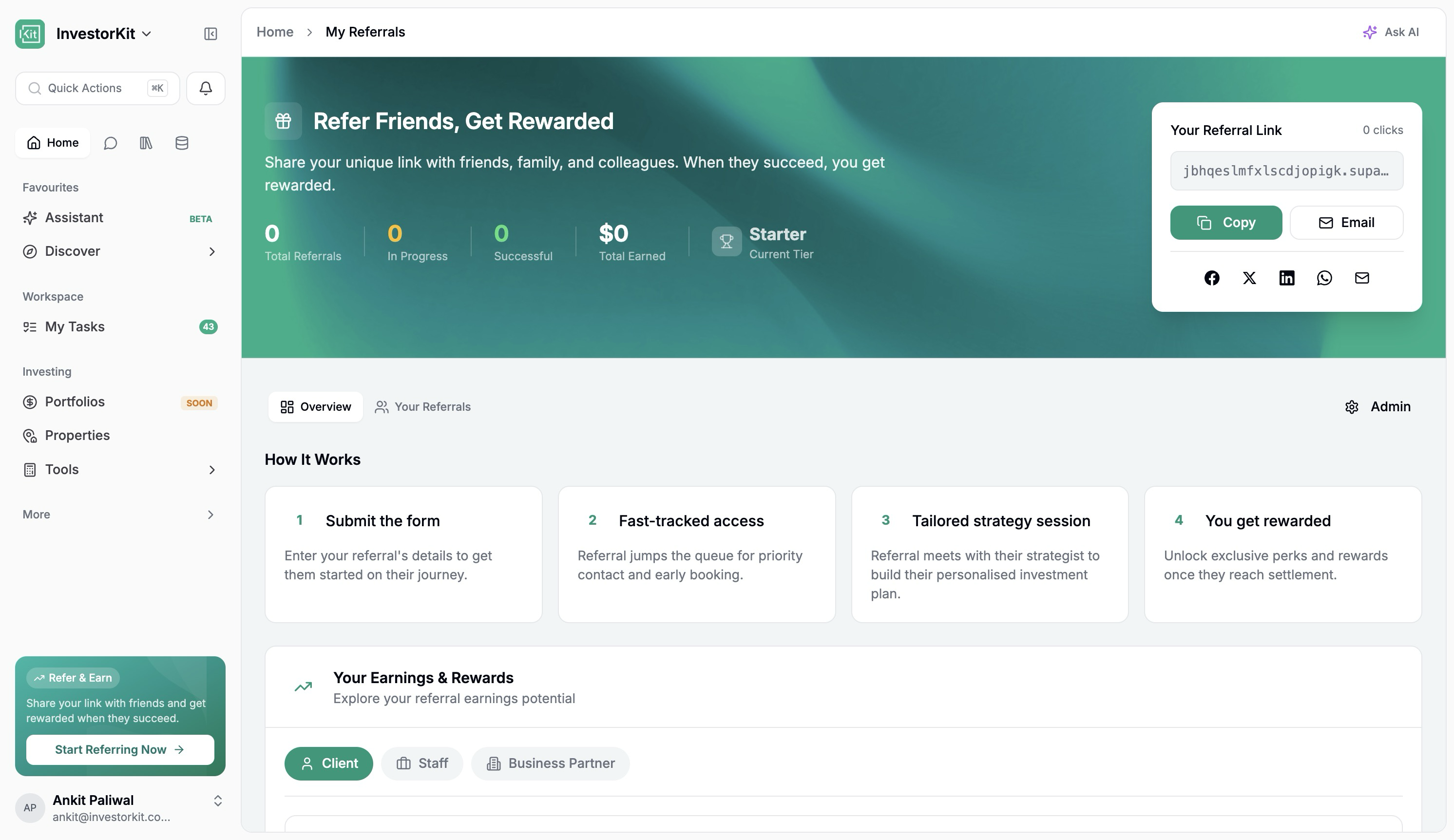
The new referral experience is one of the bigger additions in this release, although it is not launching broadly right away.
This is currently going through review with Arjun before wider rollout.
Once active, it will give users the ability to:
Copy or send referral invites directly from the Portal
Track the progress of their referrals
See where referred people are in the journey
Estimate what they could earn from referrals
There is also role-based visibility built into it, so people only see what is relevant to them. Staff can see the broader picture, clients can see the client side, and business partner views can be handled separately as that rolls out.
Users will also be able to track their own referrals in a much clearer way, so instead of referrals disappearing into a black box, people can actually see where things are at.
For admin and internal use, there is also a much stronger management interface where the team can:
Review referrals
Update milestones
Record payments
Manage payment statuses
View details in one place
This is important because it turns referrals from a loose process into something visible and trackable.
One of the more important strategic shifts in this release is that the Portal is being prepared for broader access over time.
That means the Portal is no longer being thought about only as a private area for existing InvestorKit clients and staff. It is being shaped into a place where more people can sign up, explore content, use tools, and start engaging with InvestorKit earlier in their journey. Non-customers would not see workspaces, tasks, and the full collaboration side, but they would see tools, Discover content, and property features they can use.
In practical terms, that opens the door to things like:
Signing up to access exclusive content
Reading white papers inside the Portal
Listening to exclusive content in the Portal over time
Using tools like ARI without needing the full client experience
Exploring a lighter version of portfolio and property tools
This matters because it changes what the Portal can become. Instead of only serving people once they are already deep into the InvestorKit process, it can increasingly support people earlier, help them learn, and give them reasons to keep coming back.
That is a big part of the long-term play here. The more useful the Portal becomes outside of pure client collaboration, the more it starts to look like a proper all-in-one property investing super app.
The properties experience is where some of the biggest changes have happened.
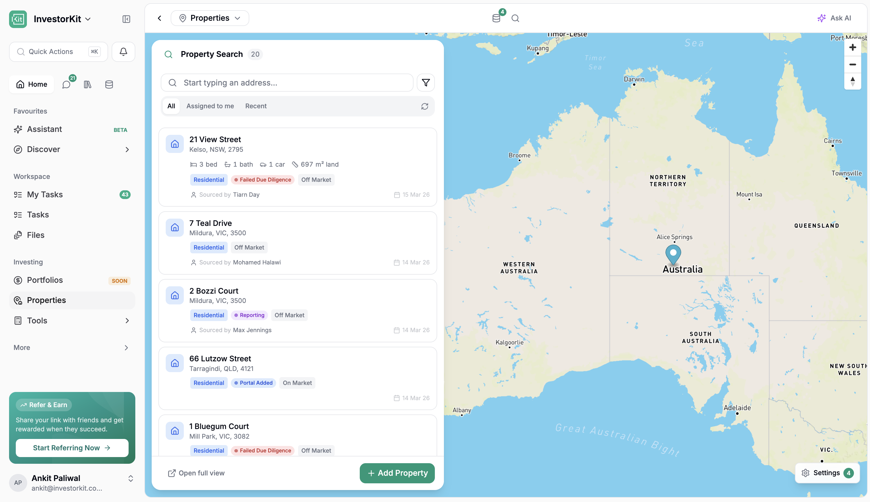
The property list is now much more useful day to day.
It pulls property data into a cleaner, more actionable view and makes it far easier to focus on the properties that matter to you.
Staff can now use Assign to Me to quickly see properties where they are:
Brief assigned to
Sourced by
Allocated to
Settlement support coordinator
That means if someone is acting as the settlement support coordinator, they can immediately focus on the properties relevant to them without hunting through everything else.
The list also surfaces the properties that were recently added or recently modified, which makes it much easier to get a quick read on what is moving.
Address search has been improved, and filtering is much more flexible, so it is easier to narrow in on delayed properties, allocated properties, and other key slices of the property list.
It also means the list feels a lot closer to a proper property command centre. You can get to the right properties faster, sort out what needs attention, and spend less time digging through records. In a real sense, the Portal is starting to build its own property management layer rather than relying on external systems for everything.
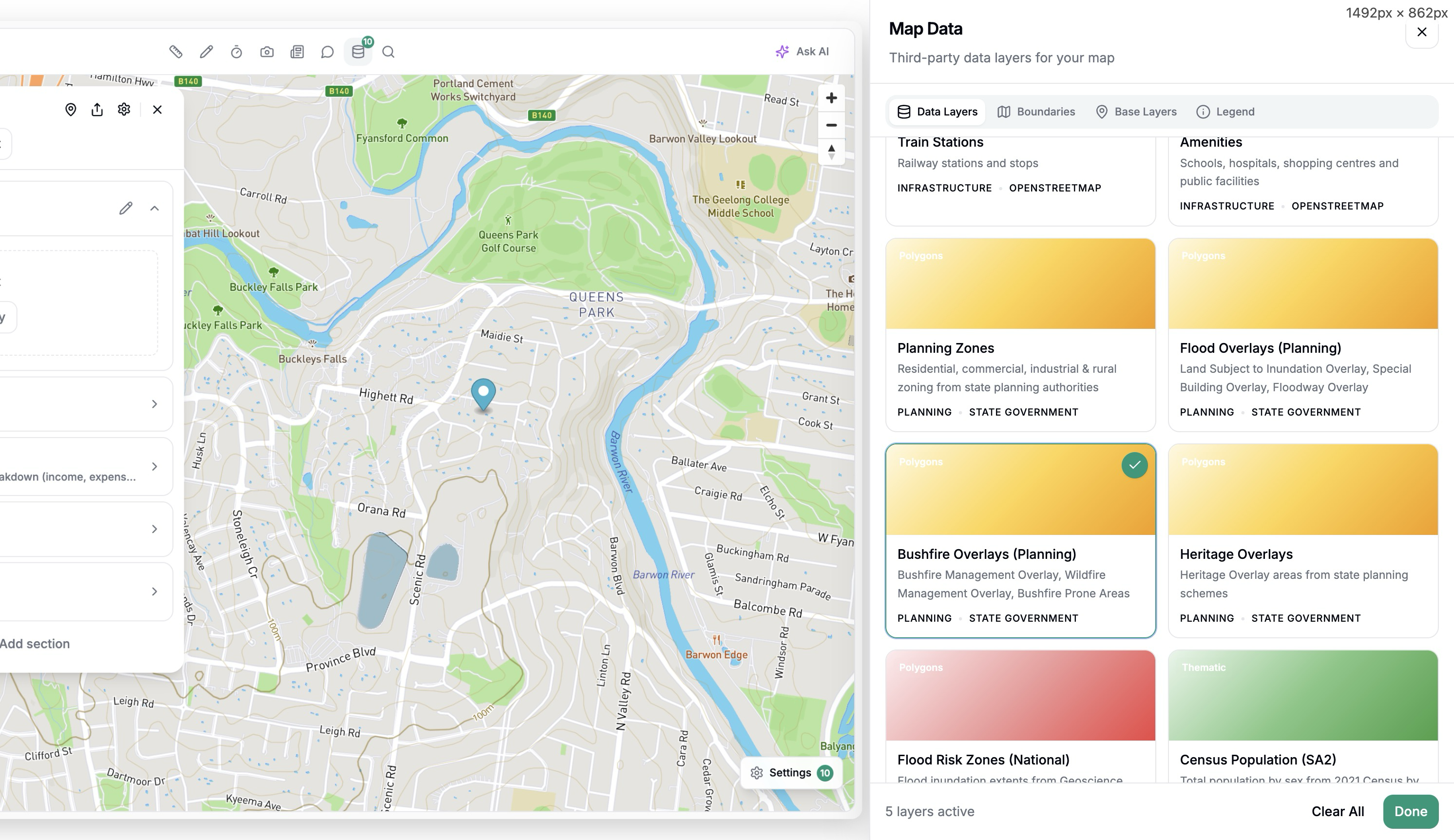
Once you open a property, the experience is far richer than before.
The property page now includes:
A more useful property summary
Better map controls
Drawing and annotation tools
Distance measurements
Different map and satellite views
Data layers such as transmission lines, substations, and transport
Google Street View
This means the property page is no longer just a record. It is becoming a proper analysis and collaboration space.
You can also add comments and notes directly onto the map. This creates a much better way to capture observations visually, especially when teams are reviewing a property together.
Support for richer annotations, such as Loom videos and images, is also on the way.
The mapping and annotation tool is our own, which is important. It means we can keep adding whatever features we need over time rather than being limited by a third-party tool.
This is one of the clearest examples in the release of the Portal becoming something bigger. Instead of jumping between maps, notes, listings, and external research, more of that work can now happen in one place.
The DataHub side is also a big part of that. Being able to turn layers on and off, see things like transmission lines, substations, and transport, and keep expanding that data set over time means the property view can keep getting smarter without needing a whole new workflow each time.
The property page now gives far more context around the area itself.
You can:
View local news generated with AI, with prompts that can be tailored to our needs
Ask follow-up questions about the suburb or location and get real-time answers from the web
Open the relevant links
Search for nearby places like supermarkets or amenities
See how far those places are from the property
This is a big shift. The property page is starting to combine property details, location context, research, and practical due diligence in one experience.
It also makes the page much more useful in real conversations. If someone wants to understand not just the property but the area around it, that context is now much easier to surface straight away.
Street View helps with that too. You can get a much more immediate feel for the property and its surroundings without leaving the Portal, which sounds small, but in practice saves time constantly.
Due Diligence has had a major upgrade and is now one of the strongest parts of the release.
The key improvement is speed. The experience has been redesigned so the team can move through DD much faster than before.
There are now multiple ways to complete Due Diligence:
This is a much cleaner yes/no workflow than the older forms. It is easier to click through and easier to review.
You can ask AI to help complete Due Diligence and even upload images or photos to support that process.
AI can pre-fill the form for review, which helps reduce repetitive manual work.
This is likely to become the fastest mode for a lot of the team.
Using keyboard-friendly quick responses, staff can move rapidly through the DD process instead of spending time on slower form interactions. Progress is visible as you move, which also makes the experience feel lighter and clearer.
For a lot of people, this will probably become the default way to work. It keeps the speed up without stripping away the structure DD needs.
The Portal can now also help pull property details from online listings.
If you add a listing link, the system can bring through details such as:
Beds
Baths
Pricing
Agent details
Land size
In the future, this will also expand to include things like gallery images and other property-level details that can be pulled through.
This saves time and reduces repeat entry.
It is also designed carefully so that it does not blindly overwrite existing information. If something is already there, the system will flag it and ask before replacing it.
Another nice improvement here is that DD is becoming better for summarising and sharing as well, not just filling fields in. It is easier to build clearer summaries, add supporting context, and make the final output easier to work with.
You can also add links, create sections, build a cleaner summary, use merge tags, and drop in Loom links that embed automatically. That makes DD feel much stronger not just as an internal checklist, but as something you can present and use more effectively afterwards.
One of the most exciting next steps here is pre-fill from data sources.
The direction is clear: if the Portal already knows useful map and research information, the team should not have to enter that manually again during Due Diligence. Things like railway and train station distance, flood maps, transformer lines, and other location data can increasingly help pre-fill DD. The Strategists just need to confirm rather than manually enter what the system already knows.
That is the bigger theme with DD now: keep the human judgement, but get the system to do more of the repetitive lifting.
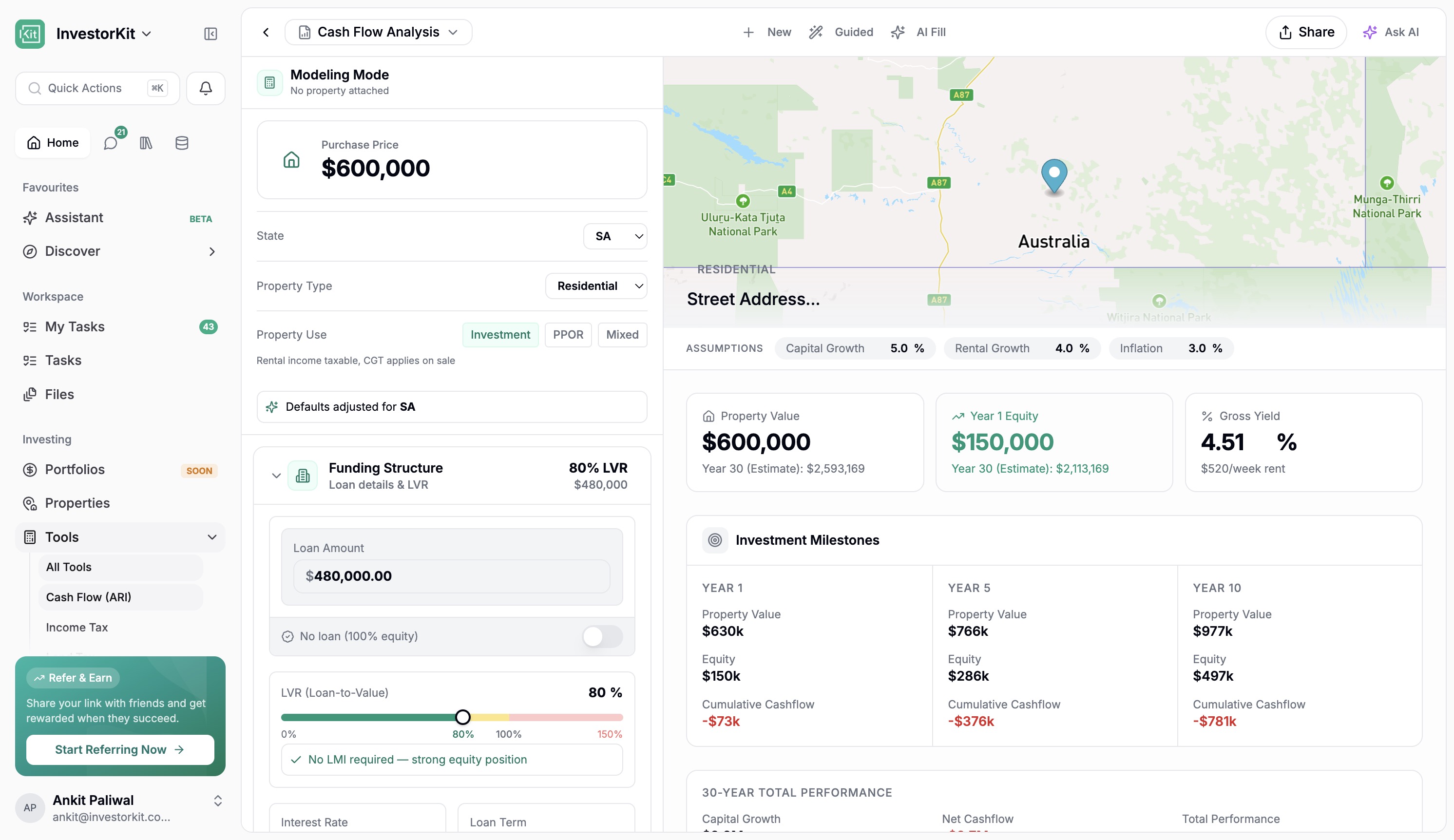
ARI has had a major glow-up too.
It can now be used as a stronger standalone tool, which matters both for clients and for future public-facing use cases.
You can generate ARI reports in different ways, including guided and AI-assisted flows, and the overall experience is much richer than before. There is also a clearer path into using it more freely as a standalone model, not only as part of a full property report flow.
The report and model views are better positioned to help people understand:
Investment milestones
30-year total performance
Cash flow summary and projections
Property-specific modelling
Better presentation of property-level cash flow
Equity composition and wealth creation views
Support for multiple income sources
Support for custom expenses with different frequencies
Better handling of employment income and purchase structures
Better handling of acquisition costs and annual holding costs
Support for property use types such as owner-occupied, investment, and mixed use, which adjusts the tax rates and LMI sliders accordingly
Support for structures such as SMSF and trust
A better way to handle annual holding costs and custom expenses
That matters because ARI is one of the clearest examples of where the Portal is heading. It is not just about showing information. It is about giving people a better way to model, test, and understand a property.
It is also important because ARI does not have to be locked to a full property report flow. As a standalone tool, it can become something people use more freely, which is a big part of the wider Portal direction.
That matters for another reason too. If people use ARI on properties we do not already have, it creates a path for those properties to be captured back into the Portal ecosystem over time, helping grow the database rather than letting that activity disappear.
Commercial ARI is now being brought into the product as well.
This part is still being refined and is currently draft-stage, but it already points to where the platform is heading next.
It is being worked through with Chris over the next few days and will continue to evolve. Even in draft form, it is a strong sign that the product is expanding beyond residential use cases and into a much broader investing toolkit.
That commercial side already points toward things like CapEx, NOI, loan balances, cumulative returns, rent structures, cash flow, vacancy cycles, and exit thinking living inside the product rather than outside it.
The communication side of the Portal has been heavily improved.
Chats are now much faster, and the organisation around chats is much better.
You can now:
Create custom views
Filter for things like unread messages or channels that need attention
See drafts and sent messages in one place
Work with groups more easily
Pin important workspace chats
Access AI chat history in one place
This is a big operational improvement because it helps the team stay on top of conversations without relying on memory.
The custom views are especially useful here. Being able to quickly surface things like unread conversations, chats that need a reply, channels assigned to certain people, or anything that has gone quiet for too long gives the team a much better grip on follow-up and accountability.
You can also see drafts, sent items, scheduled messages, direct messages, pinned workspace chats, and your assistant history in one place, which makes the whole area feel much more organised.
Inside workspaces, messaging is more useful and more actionable.
You can now:
Search across messages more easily
Ask AI about workspace history and context
Turn message references into tasks, created either in the workspace or in your personal task list
Turn date references into calendar items, with the event pre-filled with context, time, date, and a description based on the conversation
Access templates more smoothly while composing
Open supporting panels for files, details, agreements, and properties
Move through message history with highlighted search results
See calendar cards and task cards drop into the message as you type, so recipients can act on them directly
This helps move work forward faster. Instead of reading a message and then manually creating the follow-up somewhere else, the Portal can help bridge that gap directly.
That is a small change on paper, but a big quality-of-life improvement in practice. Dates in messages, task ideas, context panels, templates, and quick actions all start to reduce the friction inside the workspace itself.
There is also more flexibility around the workspace layout itself now. Files, details, agreements, properties, custom links, and other panels are easier to move through, and you can close things down to give yourself more room when you need it.
For internal users, there is also more control from the workspace details side, including things like impersonation when needed.
Tasks have been moved into a more visible position in the sidebar so they stay front of mind.
The aim here is simple: make accountability easier.
Instead of feeling tucked away, tasks are easier to see, easier to revisit, and easier to manage in the flow of everyday work.
The result is that it is much clearer what is due now, what is coming up next, and what still needs action. And if you want the more traditional milestone-style view, you can still get to that by clicking through to all tasks.
The Database area is becoming more useful as an internal admin and operations layer.
This includes:
Buying Markets
People
Users and clients
CRM views
Agreements
Properties
Message Templates
Some of these areas are still beta and will continue to improve, but the direction is important. The Portal is increasingly bringing operational data into one place in a way that is easier to work with than raw systems.
Message Templates also now have a more useful shared management space, making it easier to organise and work with templates over time.
That matters because it gives the team a more usable home for the things that normally end up scattered across tools, hidden inside CRM columns, or hard to manage at scale.
Buying Markets is a good example of where this is heading. Right now it is still a view into existing data, but over time the experience can move away from clunky raw fields and closer to a proper research view for each market.
People is also broader now, with users, clients, and CRM data sitting closer together. Even where it is still beta, it points in the right direction.
Agreements and Properties in this area are still beta too, and that is called out clearly in the experience so people know those surfaces are still being improved.
Message Templates deserve their own mention too. They are no longer tucked away. They are moving toward being something the team can properly manage in one universal place, with folders, merge tags, visibility, and better organisation.
There are also a few smaller features in this release that are easy to miss but will be genuinely handy.
Users can now set statuses such as:
Away
Busy
Active
Short custom away windows, like being away for the next 30 minutes
There is also more support around personal setup, like downloading the app and subscribing to a calendar so tasks stay synced more easily.
Mobile has had one of the biggest practical upgrades in this release.
The experience is faster, cleaner, and easier to navigate. More importantly, it is now useful for real work rather than just light access.
On mobile, users can now do much more comfortably, including:
Search across the app
Access My Tasks
Land in the right task experience depending on whether they are staff or a customer
Set statuses such as Away, Busy, or Active
Access notifications and database shortcuts more easily
Work with properties
Add properties
See properties on the map
Complete Due Diligence with a much better mobile experience
Use chats more effectively
Access workspace conversations and AI-suggested messages
Search within messages
Share and invite more cleanly from mobile flows
The mobile property and DD experience is especially important. This is one of the clearest signs that the Portal is being designed as a true field tool, not just a desktop app squeezed onto a smaller screen.
You can feel that shift in the basics too. Search is easier to get to, tasks are more accessible, chats are quicker to move through, and property flows make a lot more sense on a phone.
It is still early in the sense that there is more to come, but it already feels like a major step forward rather than a small mobile tidy-up. Even where there are little bits still to polish, the direction is obvious.
In the next few days, a new mobile app update will be going out as well.
That update is expected to bring further improvements around:
Video support
Push notifications
Mobile speed
Overall mobile experience
So while this release already makes mobile much better, there is still another important mobile step landing shortly after.
One of the strongest parts of this release is how much better the Portal feels in normal use.
The app is now more than 4x faster overall, and that holds up even in less-than-ideal conditions like being on a hotspot.
That shows up in the moments that matter:
Moving between pages
Opening chats
Switching workspaces
Loading content
Working on mobile
Jumping between key parts of the app without it feeling heavy
On top of that, a lot of bug fixing and cleanup has gone into this release. Rather than list technical items, the important outcome is this:
Login and access flows are more reliable
Notifications are more dependable
Message editing and message visibility are better
Search behaves better
Task counts, status changes, and task handling are more consistent
Referral links and related flows have been corrected
ARI and other key areas are more stable
A lot of the small annoying rough edges have been cleaned up
This is not just a feature-heavy release. It is also a major cleanup and reliability release.
That is part of why the release feels so different. It is not only that there is more in the product. It is that a lot of what was already there now feels faster, smoother, and more thought through, even when moving around quickly or using it in less-than-perfect conditions.
This release is big, and a few parts are intentionally still being refined rather than treated as fully final.
Referral system - built and reviewed internally, but not rolling out broadly straight away
Commercial ARI - active draft and being worked through over the next few days
Cash flow depreciation elements - still being tested
Some Database surfaces - still beta and will continue to improve
Community - live in an early form, with more direction still to come
Discover additions - white papers and podcast support are still to come
Further DD pre-fill - more data-assisted DD help is planned
This is a major milestone, but it is also a launch pad for what comes next.
The real headline here is that the Portal is becoming far more than a workspace.
It is becoming an all-in-one property investing super app for:
Communication
Learning
Property analysis
Due Diligence
Modelling
Portfolio context
Mobile work
For staff, this means faster execution, better visibility, and more powerful tools in one place.
For clients and future users, it points to a much richer product experience where the Portal can help well beyond simple collaboration.
This is a major milestone for the team, and there is still more to come over the next few days as rollout polish continues. The speed improvements alone will keep getting better from here.
Tech may have felt quiet from the outside for a while, but this is why. A lot has gone into this release, and it sets up a much bigger next phase for the Portal from here.